 --
-- The "pause" lives on!
An industrious graph-maker (Australian, Ken Stewart) has just turned the latest UAH (satellite) data into a series of graphs, with different graphs for various regions of the world. That supposedly "global" warming was not showing up in his local area was what got him blogging.
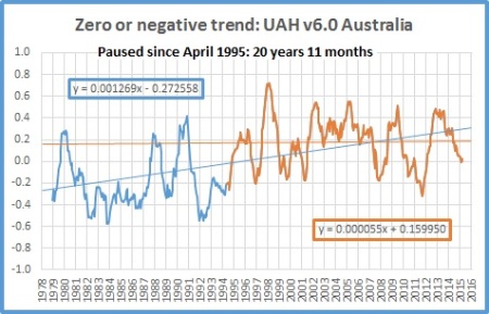
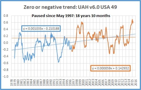
So his latest graphs follow on neatly from something I pointed out yesterday: That it is absurd to speak of "global" warming at a time when some parts of the globe are in fact cooling. I offered only the authority of my Crepe Myrtle trees for that observation but our industrious blogger offers the satellite evidence on that. He shows that the trend lines differ from one another in the 11 areas he singles out. Note the final squiggle on the graphs for the USA and Australia. Where the USA squiggles upward, Australia squiggles downwards
I reproduce below only three of his graphs but I think they are the ones of greatest interest: Graphs for the globe, the USA and Australia. He shows that the pause has lasted 18 years and 10 months in the USA but in Australia it has lasted 20 years and 11 months.
UAH v6.0 data for February have been released. Here are updated graphs for various regions showing the furthest back one can go to show a zero or negative trend (less than +0.1C/ 100 years) in lower tropospheric temperatures. Note: The satellite record commences in December 1978- now 37 years and 3 months long- 447 months. 12 month running means commence in November 1979.
Despite the record TLT for February, I am sorry to disappoint GWEs that The Pause has not disappeared. In some regions it has lengthened, in others it has shortened, and in the Northern Extra-Tropics it has disappeared (by my criterion)- but mostly it has remained at the same length.

SOURCE
No comments:
Post a Comment
All comments containing Chinese characters will not be published as I do not understand them