 --
-- What happens when you use only quality data to measure warming?
I generally don't comment on reports that appear on the site of Anthony Watts, because I assume that anybody reading this blog will already be reading that one. He has a much bigger readership than I do. This time I think I need to say something however.
The background is that Anthony is a skeptical meteorologist who has long bent over backwards to achieve some respectability among climate scientists. That is not my style at all -- I never give an inch for the sake of popularity -- but maybe Anthony is right and I am wrong in the great scheme of things. And he has finally got what must be his heart's desire by being allowed to present a paper at the AGU. And it is that paper that I want to talk about. The report below tells you some things about it but not, in my view, the most important things.
For a start, there is here a graph that summarizes Anthony's findings. It is too large for me to reproduce usefully on this page but you can see it if you click on the link. It is an extraordinarily poor graph. If I had been handed it as a student assignment in my statistics classes, I would have failed it. There is no calibration on the X axis and unexplained calibration on the Y axis. So I have to be a bit approximate in some of the things I want to say about it.
One of the reasons statisticians graph things is to detect non-linear relationships -- and when I look at Athony's graph I immediately detect something of that kind. The graph seems bimodal to me. The temperature seems just about flat up to about the year 2000 and then takes a leap onto a new plateau after that time. So what I think we see is not a steady upward trend but two flat records with a short sudden leap from one to the other.
But Anthonly ignores that. His analysis looks only at a steady upward trend. Why? Because his whole presentation is designed not to rock the boat too much. By combining the data from the '80s and '90s (which did show some warming) with the 21st century data (which shows no warming), he gets an overall upwards temperature rise -- which is just what the Warmists want. By failing to consider the pre- and post- 2000 data separately, Anthony ignores the "pause", the period in the 21st century temperature record that even Warmists concede has shown no statistically significant change in global temperature.
Anthony will no doubt say that I misconceive what he was trying to do and that may be so but I am concerned that Warmists will now be able to say that a prominent skeptic has admitted that the globe is still warming after all -- when that is clearly not the case. The overall temperature rise that Anthony reports is nothing more than a statistical artifact, and a deliberate one at that.
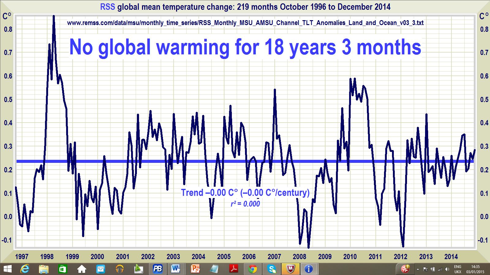
Here once again is the graph of the satellite temperature record:
Anthony's data are of course from the USA only so, logically, one could say that they tell us nothing about global temperatures. The USA could be entirely atypical of the globe. I am not, however, aware that anybody has ever put forward such an improbable proposition. In any case, my criticism concerns the misinterpretation of a graph, nothing more.
And if the graph is typical of the globe, it gives Warmists a new big problem. None of their models and theories even begin to account for a recent sudden step change in temperature over just a year or two. Or have we already had the famed "tipping point"?!
Surface temperatures recorded over three decades at 410 ideally situated weather stations are markedly lower than temperatures recorded at stations located near multiple heatsinks, according to a new study presented Thursday at the 2015 fall meeting of the American Geophysical Union in San Francisco.
The study examined the 30-year temperature records collected from a subset of 410 weather stations belonging to the National Oceanographic and Atmospheric Administration’s (NOAA) Historical Climatology Network (USHCN) of 1,218 stations.
“A 410-station subset of U.S. Historical Climatology stations is identified that experienced no changes in time of observation or station moves during the 1979-2008 period. These stations are classified on proximity to artificial surfaces, buildings, and other such objects with unnatural thermal mass,” according to the study, entitled Comparing of Temperature Trends Using an Unperturbed Subset of the U.S. Historical Climatology Network.
“The United States temperature trends estimated from the relatively few stations in the classes with minimal artificial impact are found to be collectively about 2/3 as large as US trends estimated in the classes with greater expected artificial impact,” the researchers report.
The study “suggests that the trend for U.S. temperature will need to be corrected. We also see evidence of this same sort of siting problem around the world at many other official weather stations, suggesting that the same upward bias on trend also manifests itself in the global temperature record.”
However, “the data suggests that the divergence between well and poorly sited stations is gradual, not a result of spurious step change due to poor metadata,” they concluded.
“The majority of weather stations used by NOAA to detect climate change temperature signal have been compromised by encroachment of artificial surfaces like concrete, asphalt, and heat sources like air conditioner exhausts. This study demonstrates conclusively that this issue affects temperature trend and that NOAA’s methods are not correcting for this problem, resulting in an inflated temperature trend,” said lead author Anthony Watts, who blogs at Watts Up With That?
The best stations (Class 1) are defined as those situated on “flat and horizontal ground surrounded by a clear surface with a slope below 1/3 (<19 deg.). Grass/low vegetation ground cover <10 centimeters high. Sensors located at least 100 meters from artificial heating or reflecting surfaces, such as buildings, concrete surfaces, and parking lots. Far from large bodies of water, except if it is representative of the area, and then located at least 100 meters away. No shading when the sun elevation >3 degrees,” according to NOAA's 2002 Site Information Handbook.
The worst (Class 5) have their “temperature sensor located next to/above an artificial heating source, such as a building, roof top, parking lot, or concrete surface.”
“The poorest sites tend to be warmer,” explained co-author John Nielsen-Gammon, professor of atmospheric sciences at Texas A&M University.
SOURCE
No comments:
Post a Comment
All comments containing Chinese characters will not be published as I do not understand them